HTML Tables: Styling with CSS
While we can use table attributes like "border" to facilitate table style, the recommended approach is to use CSS. Accordingly, this page discusses styling HTML tables using CSS.
There are two ways to add CSS design for a table (or any HTML element, for that matter). First is to use the <style> tag and enclose CSS rules for table elements. Second is to keep the CSS rules in a CSS file and then include it in the HTML file using the <link> tag.
So, let us begin by adding a table border using the <style> tag. Though, we add a bunch of code instead of a line, the style-related code now sits separately from the table itself. This is one of the powerful constructs: separation of design and content! If you notice the content in the style, then all it has is a table and the CSS rule for that table are enclosed within curly braces. This is CSS semantics. To put it simply, the rule says that for all tables that are present in this file (aka HTML page), we are going to add a medium-thick solid blue border. That's all!
 <!doctype html>
 <html>
 <head>
     <title> HTML Tables: Styling with CSS</title>
     <style>
     table {
         border: medium solid blue;
     }
     </style>
 </head>
 <body>
 <table>
     <caption>Planet: Largest Moon</caption>
     <tr><th>Planet  </th><th>Largest Moon </th></tr>
     <tr><td>Mercury </td><td>        </td></tr>
     <tr><td>Venus   </td><td>        </td></tr>
     <tr><td>Earth   </td><td>Moon    </td></tr>
     <tr><td>Mars    </td><td>Phobos  </td></tr>
     <tr><td>Jupiter </td><td>Ganymede</td></tr>
     <tr><td>Saturn  </td><td>Titan   </td></tr>
     <tr><td>Uranus  </td><td>Titania </td></tr>
     <tr><td>Neptune </td><td>Triton </td></tr>
 </table>
 </body>
 </html>
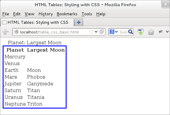
When we load the page, we would see that CSS indeed delivers on its promise and we would see a solid blue boundary around the table.

Figure: HTML table -- CSS design
However, in terms of separation of concerns, the preferred approach is to go one step further! For that, we move the CSS rules in a separate file; we call it "style.css:". Then include that using the <link> tag in the HTML page. Here is the CSS file:
 table {
     border: medium solid blue;
 }
And, here is the modified HTML file. Instead of all the CSS code, all it has is one simple line of <link> tag that tells the browser to include "style.css" CSS file. Note that the "rel" attribute of the link tells the browser that the file is actually a CSS stylesheet.
 <!doctype html>
 <html>
 <head>
     <title> HTML Tables: Styling with CSS</title>
     <link rel="stylesheet" href="./style.css" type="text/css">
 </head>
 <body>
 <table>
     <caption>Planet: Largest Moon</caption>
     <tr><th>Planet  </th><th>Largest Moon </th></tr>
     <tr><td>Mercury </td><td>        </td></tr>
     <tr><td>Venus   </td><td>        </td></tr>
     <tr><td>Earth   </td><td>Moon    </td></tr>
     <tr><td>Mars    </td><td>Phobos  </td></tr>
     <tr><td>Jupiter </td><td>Ganymede</td></tr>
     <tr><td>Saturn  </td><td>Titan   </td></tr>
     <tr><td>Uranus  </td><td>Titania </td></tr>
     <tr><td>Neptune </td><td>Triton </td></tr>
 </table>
 </body>
 </html>
If we load the above HTML code, then we would see an output identical to that of the earlier example -- a table with blue border around it. We omit the output.
Now that we have gotten the basics out of the way (phew!), let us have some more fun! For that, we add more table-related style elements to "style.css". There are several CSS rules for HTML table element -- in these examples, we touch upon a few of those that are commonly used. Our examples keep the HTML code same and merely update the CSS style file. This is also an explicit demonstration of the power of separation of content and style. By updating the CSS file, we are changing the style but the basic HTML content remains completely unchanged.
Currently, our CSS style file ("style.css") has a simple table border. However, we can use similar rules for <th> and <td> tags as well and add borders around each data cell. And while we are at it, we also add a bunch of other desirable design pieces. First, we throw-in some padding for each cell -- the padding makes the table cells have some pre-specified size otherwise the appear relatively collapsed.
Second, we touch upon the styling for the table caption. For that, we use the "caption-side" CSS rule to place the caption at the bottom, which normally shows up at the top. Next, we specify properties for the caption text like weight and color. We add margin to the table on the top, left, and right side. Lastly, among other things, we also use "caption" selector to add color and weight to design the table caption.
With that, here is how our updated CSS file ("style.css") looks like:
 table {
     margin-top: 20px;
     margin-left: 20px;
     margin-right: 20px;
     border: medium solid blue;
     caption-side: bottom;
 }
 th, td {
     border: thin solid blue;
     padding: 4px;
 }
 caption {
     font-weight: bold;
     color: blue;
 }
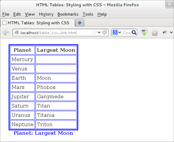
Here is the output with additional style elements:

Figure: HTML table -- CSS design for th and td elements
Let us continue to improve our CSS style for the table. If we note in the earlier example, we would see that the the border of each cell has some space between them and thus, we see two lines for each cell -- one of the current cell and the other for the adjoining cell. CSS has a "border-collapse" property to collapse the two lines into one. Let us try that.
 table {
     margin-top: 20px;
     margin-left: 20px;
     margin-right: 20px;
     border: medium solid blue;
     caption-side: bottom;
     border-collapse: collapse;
 }
 th, td {
     border: thin solid blue;
     padding: 4px;
 }
 caption {
     font-weight: bold;
     color: blue;
 }
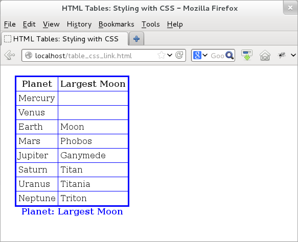
With that, if we were to load the HTML page, then we would see that the two lines forming the border for each cell are now collapsed into one. The table is beginning to look good!

Figure: HTML table -- CSS design to collapse cell borders
Our last styling element focuses on improving readability of table content. For that, one of the common tricks is to assign same color to alternative rows. For that, CSS has another trick up its sleeves: ":nth-child()" pseudo-class. We can use this construct to assign colors to "even", "odd", or even numeric elements. This pseudo-class can be applied to several HTML elements as well -- in this case, we apply it to <tr> since we are interested in giving a common color to alternate rows.
Here is the updated CSS file, where we use ":nth-child()" pseudo-class to add colors to even rows:
 table {
     margin-top: 20px;
     margin-bottom: 20px;
     margin-left: 20px;
     margin-right: 20px;
     border: medium solid blue;
     caption-side: bottom;
     border-collapse: collapse;
 }
 th, td {
     border: thin solid blue;
     padding: 4px;
 }
 tr:nth-child(even) {
     background-color: #CEE3F6;
 }
 caption {
     font-weight: bold;
     color: blue;
 }
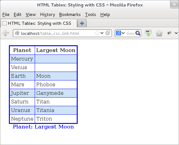
The output confirms that alternative cells -- even cells, to be more precise -- now have a blue background. Please note that since we apply nth-child property to even rows, we see that the second, fourth, and so on rows have the applied color.

Figure: HTML table -- CSS design for adding color to even rows